 DLG, digital line graph, is a form of a digital map created by the USGS that uses a topological vector model. This is a DLG map of Columbus, Ohio. http://daniellemapcatalog.blogspot.com/2008_11_01_archive.html
DLG, digital line graph, is a form of a digital map created by the USGS that uses a topological vector model. This is a DLG map of Columbus, Ohio. http://daniellemapcatalog.blogspot.com/2008_11_01_archive.html
DLG, digital line graph, is a form of a digital map created by the USGS that uses a topological vector model. This is a DLG map of Columbus, Ohio. http://daniellemapcatalog.blogspot.com/2008_11_01_archive.html
 DRG, digital raster graphic, is a scanned copy of a USGS topographic map. It represents all georeferenced images on earth. This map shows the Potomac River. http://egsc.usgs.gov/isb//pubs/factsheets/fs08801.html
 An isopleth map generalizes and simplifies data with a continuous distribution. This map shows isopleths of air pressure.
http://albanesemapcatalog.blogspot.com/2011_04_01_archive.html
An isopleth map generalizes and simplifies data with a continuous distribution. This map shows isopleths of air pressure.
http://albanesemapcatalog.blogspot.com/2011_04_01_archive.html
 An isopach map is a map illustrating variation of thickness within a stratum. Isopachs are contour lines of equal thickness over an area. This map is showing the thickness near the Michigan area. http://shannonmapcatalog.blogspot.com/
 An isohyet is a line joining points of equal precipitation on a map. This is map shows the average rainfall in Hong Kong.
http://www.hko.gov.hk/wxinfo/pastwx/mws201206.htm
An isohyet is a line joining points of equal precipitation on a map. This is map shows the average rainfall in Hong Kong.
http://www.hko.gov.hk/wxinfo/pastwx/mws201206.htm
 Isotach lines are equal in wind speed. The direction of the "L" looking objects indicate from what direction the wind is originating. http://candacesmaps.blogspot.com/2010/12/isotachs.html
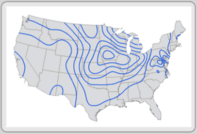
 An Isobar is a line connecting points of equal atmospheric pressure. In this map of the United States the winds flow roughly parallel to the isobars. http://www.mv.k12.wa.us/science/integrated/athena/curric/weather/hsweathr/isobar.html
 LIDAR (Light Detection And Ranging) is an optical remote sensing technology that can measure the distance to often using pulses from a laser. A LIDAR map gets its name from light, detection, and ranging. It measures the properties of the scattered light to find the range of things in the distance. This is a three dimensional model taken September 17, 2001 of the World Trade Center area in New York City. The images were used by emergency managers to assess damage through the smoke after the World Trade Center Tragedy. http://www.loc.gov/exhibits/911/911-maps.html
 A doppler radar map uses microwaves to track direction and speed of suspended water in the atmosphere and determines the motion. This is a doppler radar of a hurricane over the east coast of Florida. http://www.noaanews.noaa.gov/stories2004/s2311.htm
 A black and white aerial photo is similar to that of an infrared photo except for the fact that a black and white camera is used above an area. In this photo it is a picture of Pearl Harbor. http://pubs.usgs.gov/of/1995/of95-017/
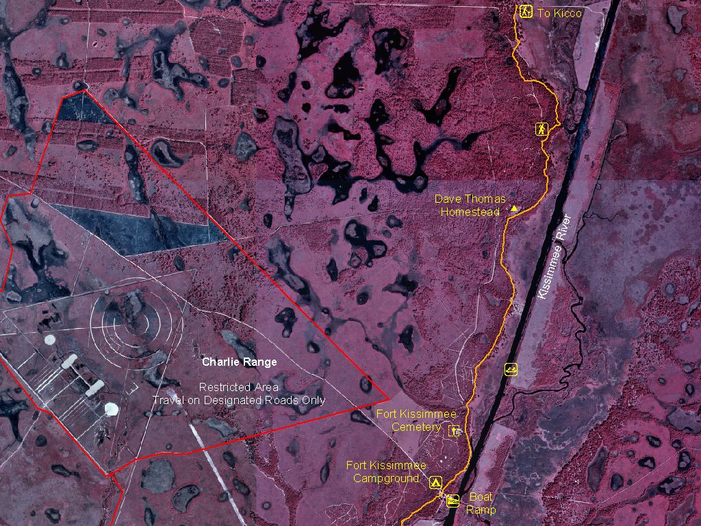 Infrared aerial mapping is when a film or image sensor is used to exposed the sensitivity of infrared light. These photos are taken from above the target and omit a red lighting. This is a map of the Avon Park Air Force Range.
http://www.outintheboonies.com/Avon_Park_AFR/
Infrared aerial mapping is when a film or image sensor is used to exposed the sensitivity of infrared light. These photos are taken from above the target and omit a red lighting. This is a map of the Avon Park Air Force Range.
http://www.outintheboonies.com/Avon_Park_AFR/
 Cartographic animation is when the use of animation, normally computer generated, to add a temporal component to a map displaying change in some dimension. The change is shown over time. This map shows the meteorological animation which displays the total precipitation and winds on August 4, 1996. http://50mapsfromericawest.blogspot.com/2011_07_01_archive.html
 A statistical map is a map that represents graphical information that is put in the form of statistics. The map shows the income percentages of each state in the United States in 2008. It also shows that Michigan has the lowest income level while Hawaii has the highest. http://hoekstrasmaps.blogspot.com/2009_04_01_archive.html
 Cartograms are used to display ratios of information such as spending rates, mortality rates, population or consumption rates. This map shows the 1996 Presidential vote results in the United States.
http://www.ncgia.ucsb.edu/projects/Cartogram_Central/gallery.html
Cartograms are used to display ratios of information such as spending rates, mortality rates, population or consumption rates. This map shows the 1996 Presidential vote results in the United States.
http://www.ncgia.ucsb.edu/projects/Cartogram_Central/gallery.html
 Flow maps are used to show the order of an event and the relationships of the stages in the process. In the map you can see the progress of what it would take for someone to go to school. You see in the map it flows from a patient wanting a referral to the front office to the insurance company. It flows from one event to another. http://www.aafp.org/fpm/2005/0400/p61.html
 Isoline maps are used to represent a three dimensional model on a two dimensional scale. This is done by connecting lines that represent the same value. This map shows the weather in the United States. As you can see there are lines across the map and those lines form circles. Each circle has a particular weather in that area, which isn't shown on this map.
http://giscommons.org/output/
Isoline maps are used to represent a three dimensional model on a two dimensional scale. This is done by connecting lines that represent the same value. This map shows the weather in the United States. As you can see there are lines across the map and those lines form circles. Each circle has a particular weather in that area, which isn't shown on this map.
http://giscommons.org/output/
 A choropleth map is a map that uses differences in shading or coloring in an area to represent the average values of a quantity of something in that area. The map shows the Latino population in the state of Florida in 2000. The darker the area the more dense the population. http://my.ilstu.edu/~jrcarter/Geo204/Choro/Tom/
 A dot distribution is a map that uses dots to portray a feature such as a disease or a something similar to that. In the map it shows how AIDS was distributed in the United States up to 1997. Each dot represents 30 cases of AIDS. This map is a great example of a dot distribution map because it uses dots to describe the distribution of AIDS.
https://blogger.googleusercontent.com/img/b/R29vZ2xl/AVvXsEi3U8r_T7DUod02M0NRccvdwU2c2aGHBRkxXswKrc-eAvYHDVGFgu8xt1f58_saZnBJKqkydYC8Hw_gVZJqt7ldTdbBgmO7fSFMdJc2T2tD5AWnPHltJZFYxeBci7WrbtbJaylJqZRHcf0/s1600/dot+distribution.png" imageanchor="1" >
A dot distribution is a map that uses dots to portray a feature such as a disease or a something similar to that. In the map it shows how AIDS was distributed in the United States up to 1997. Each dot represents 30 cases of AIDS. This map is a great example of a dot distribution map because it uses dots to describe the distribution of AIDS.
https://blogger.googleusercontent.com/img/b/R29vZ2xl/AVvXsEi3U8r_T7DUod02M0NRccvdwU2c2aGHBRkxXswKrc-eAvYHDVGFgu8xt1f58_saZnBJKqkydYC8Hw_gVZJqt7ldTdbBgmO7fSFMdJc2T2tD5AWnPHltJZFYxeBci7WrbtbJaylJqZRHcf0/s1600/dot+distribution.png" imageanchor="1" >
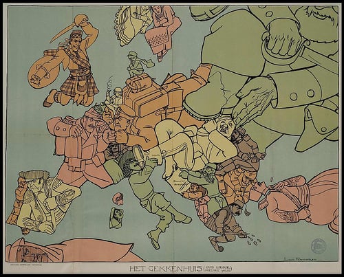 A propaganda map is very similar to propaganda cartoon. It portrays something in an inaccurate way or created using subjectivity with the goal of persuasion. They cartographer draws the map for the same reason a cartoonist would draw a propaganda cartoon. In the map you can see how each country was seen through the eyes of a Dutch cartographer. It shows how each country acted toward each other during that time period. http://dish.andrewsullivan.com/2013/07/22/maps-as-political-tools/
 A hypsometric map is a topography map which involves a color sequence to show how much something occurs in that region. It could represent rainfall, population size, or immigration movement. In this map it shows how much rainfall occurred from 1961-1990.
http://www.shadedrelief.com/hypso/hypso.html
A hypsometric map is a topography map which involves a color sequence to show how much something occurs in that region. It could represent rainfall, population size, or immigration movement. In this map it shows how much rainfall occurred from 1961-1990.
http://www.shadedrelief.com/hypso/hypso.html
 PLSS, Public Land Survey System, is a way the United States divides the land up. It is normally used for rural areas or undeveloped land. The map that you see here shows how Florida is broken up. It separates the counties to show how much land each county uses. This is a PLSS map because it shows how the land is split up between the counties. Granted it isn't a rural area but it does portray the land use.
http://cartographic-catalog.blogspot.com/2012/04/public-land-survey-system-plss.html
PLSS, Public Land Survey System, is a way the United States divides the land up. It is normally used for rural areas or undeveloped land. The map that you see here shows how Florida is broken up. It separates the counties to show how much land each county uses. This is a PLSS map because it shows how the land is split up between the counties. Granted it isn't a rural area but it does portray the land use.
http://cartographic-catalog.blogspot.com/2012/04/public-land-survey-system-plss.html
 A cadastral map shows the property area of a city or region. It shows the space of each land. For instance a cadastral map of a neighborhood would show the size of the land that each house can occupy. In the map here it shows the historical map of Washington D.C. and how much each building occupied.
http://www.dcvote.org/trellis/character/historicalmaps.cfm?print=1
A cadastral map shows the property area of a city or region. It shows the space of each land. For instance a cadastral map of a neighborhood would show the size of the land that each house can occupy. In the map here it shows the historical map of Washington D.C. and how much each building occupied.
http://www.dcvote.org/trellis/character/historicalmaps.cfm?print=1
 Thematic maps are used to portray an area and apply a theme to it. The theme can be social, political, agricultural, and other aspects to define a city, region or country. In this map it shows what political party is running each state in 2007. It portrays how the Republican party was running the majority of the United States. This map shows how a thematic map works.
http://www.gigawiz.com/thematic.html
Thematic maps are used to portray an area and apply a theme to it. The theme can be social, political, agricultural, and other aspects to define a city, region or country. In this map it shows what political party is running each state in 2007. It portrays how the Republican party was running the majority of the United States. This map shows how a thematic map works.
http://www.gigawiz.com/thematic.html
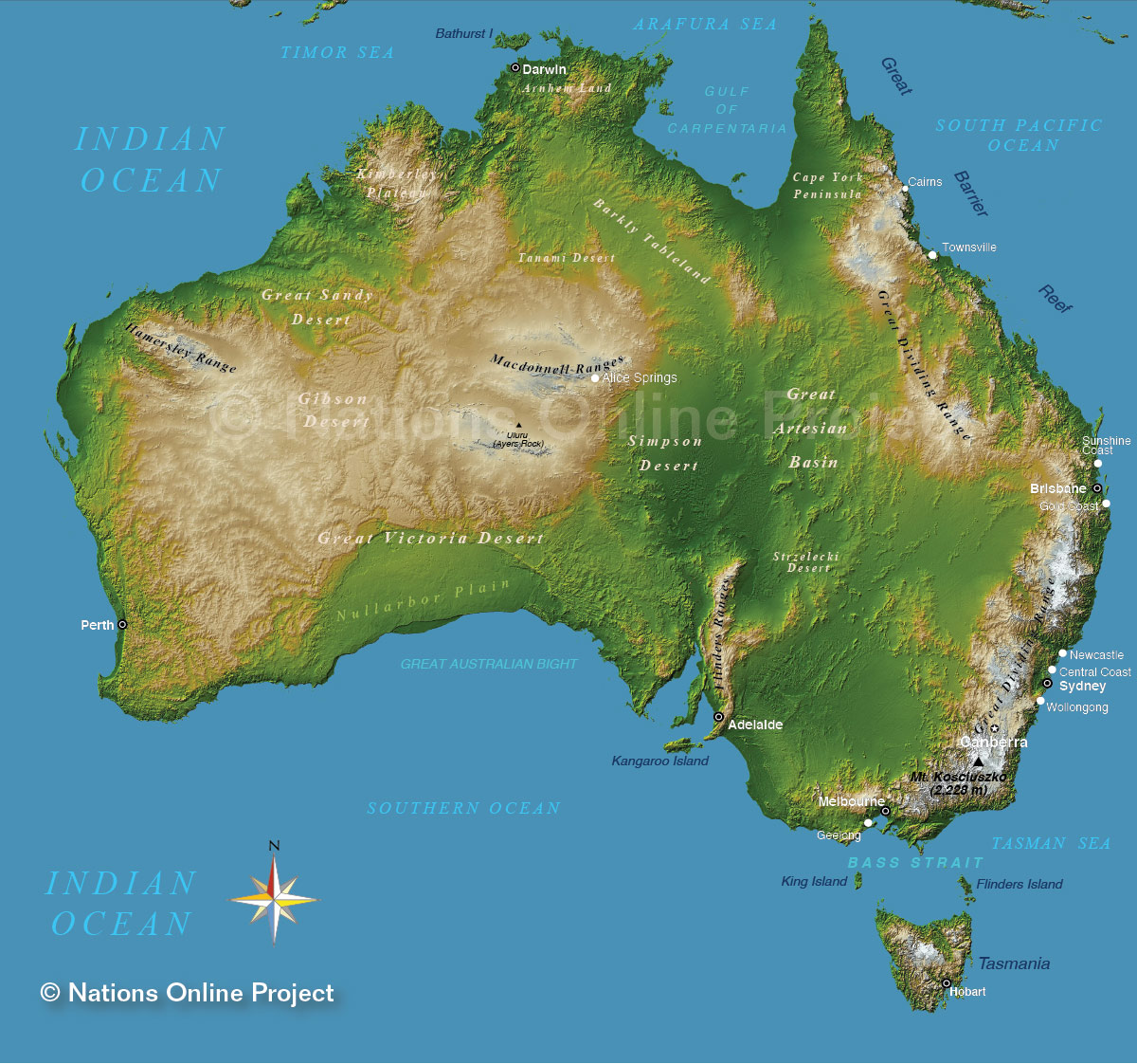 A topographic map shows the natural layout of the area. This map shows the topographic layout of all of Australia. It shows where the desert, mountain ranges and the basin. This map is a prime example of what a topographic map is.
http://www.nationsonline.org/oneworld/map/australia-topographic-map.htm
A topographic map shows the natural layout of the area. This map shows the topographic layout of all of Australia. It shows where the desert, mountain ranges and the basin. This map is a prime example of what a topographic map is.
http://www.nationsonline.org/oneworld/map/australia-topographic-map.htm
 For this map it conveys a planimetric map. A planimetric map is when a map shows a grid-like structure on the map. It shows the layout of the area without showing the elevation of the area. The map that is portrayed here shows the layout of city of Manhattan and all the streets and neighborhoods within the city.
http://similaritymatrix.blogspot.com/2009/09/planimetric-map.html
For this map it conveys a planimetric map. A planimetric map is when a map shows a grid-like structure on the map. It shows the layout of the area without showing the elevation of the area. The map that is portrayed here shows the layout of city of Manhattan and all the streets and neighborhoods within the city.
http://similaritymatrix.blogspot.com/2009/09/planimetric-map.html
 This map conveys what the typical college student sees the world as. It classifies as a mental map because it portrays what the student sees in their mind but in reality it truly isn't what the world looks like. The map shows the world as smaller version of an actual map. In this map, the land masses are significantly smaller than the Atlantic Ocean. The Pacific Ocean is a lot smaller as well. This is a great map to portray a mental map. http://lacamina.blogspot.com/2008/09/mental-map.html

