 A stem and leaf plot is a numerical display of the distribution of a variable. The information is written to show that the last digit is the leaf and the rest of the numbers in front are the stem. The one above is just an example on how stem and leaf plots work. http://www.webquest.hawaii.edu/kahihi/mathdictionary/images/stem_leaf_graph1.gif
Tuesday, November 19, 2013
Stem and leaf plot
 A stem and leaf plot is a numerical display of the distribution of a variable. The information is written to show that the last digit is the leaf and the rest of the numbers in front are the stem. The one above is just an example on how stem and leaf plots work. http://www.webquest.hawaii.edu/kahihi/mathdictionary/images/stem_leaf_graph1.gif
Box plot
Histogram
 A histogram is a diagram consisting of individual bars who has different values. The values are dependent on the y-axis and the x-axis. The y-axis determines how high the bars will rise, while the x-axis is what we are measuring. The map shows the hours of delay in traffic per major city. http://www.coolinfographics.com/blog/2010/2/9/city-population-shift-maps.html
Parallel coordinate graph
Triangular plot map
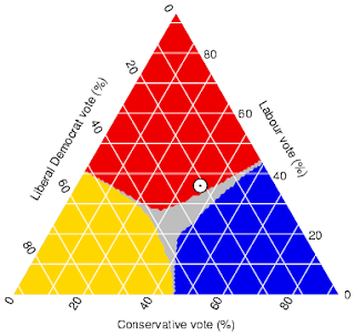 A triangular plot map is a way to plot three different variables which have the same purpose. It shows the ratios of the three variables on an equilateral triangle. The picture shows how each corresponding major parties would win over majority in Parliament.
http://kelseyherritt.blogspot.com/2011/04/triangular-plot.html
Wind rose map
Sunday, November 17, 2013
climograph
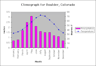 This climograph is of the United States over a whole calendar year. A climograph is a graphical depiction of the monthly precipitation and temperature conditions for a selected place. This one shows the climograph of Boulder, Colorado.
http://www.colorado.edu/geography/extra/geogweb/manitousprings/intro/page2.html
population profile
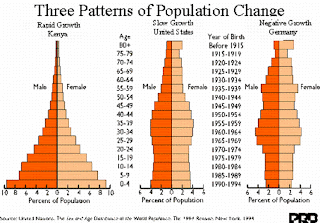 Population profiles or population pyramids are commonly used to show the trends in population statistics over time. The first pyramid shows that Kenya has rapid growth. They have a very young population with high fertility rates and high death rates among their older population. http://albanesemapcatalog.blogspot.com/2011/04/population-profile.html
scatter plot
index value plot
Lorenz curve
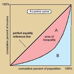 A Lorenz curve represents a probability distribution of statistical values, and often shows the degree of inequality that exists between two variables. For instance, in this Lorenz curve, the distribution of income is illustrated in reference to the percent of the population. http://mapanalysis.blogspot.com/2011/04/lorenz-curve.html
bilateral graph
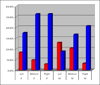 A bilateral graph displays two or more related sets of data on that same graph. This graph can be a line graph, bar graph, or some other type of graph. This map shows the comparison of two variables. It shows "Forced" Preference for Communism versus Fascism.
http://chasesmaps.blogspot.com/2010/11/bilateral-graph.html
nominal area choropleth map
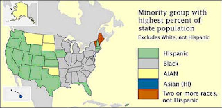 A nominal area choropleth map is a thematic map that displays areal data. These maps use different colors or patterns to distinguish between certain areas or regions. The data that is represented is nominal data, meaning there is no ranking order for each category, so therefore a rainbow of different colors is many times used. This map shows the minority groups with highest percent of state population. http://tomsmapcatalog.blogspot.com/2010/04/nominal-area-choropleth-map.html
unstandarized choropleth map
Standarized choropleth map
Univariate choropleth map
bivariate choropleth map
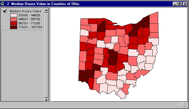 A bivariate choropleth map shows two variables on the same map. A bivariate map may consist of line features, polygon features, or point features. The map above is an bivariate map depicting the median house values in counties all over Ohio.
http://proceedings.esri.com/library/userconf/proc99/proceed/papers/pap171/p171.htm
unclass choropleth map
Class Choropleth map
range graded proportional circle map
continuously variable proportional circle map
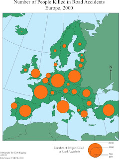 Continuously variable proportional circle map portrays data is being depicted by using dots that are proportional in scale and location of the information being represented. In this map it shows a map of people killed in road accidents in Europe.
http://irvinecatalogs.blogspot.com/2011/07/range-graded-proportional-circle-map.html
DOQQ map
DEM map
Sunday, September 8, 2013
"DLG map"
"DRG map"
"Isopleth map"
"Isopach map"
"Isohyets map"
"Isotachs map"
"Isobars map"
Saturday, September 7, 2013
"LIDAR map"
 LIDAR (Light Detection And Ranging) is an optical remote sensing technology that can measure the distance to often using pulses from a laser. A LIDAR map gets its name from light, detection, and ranging. It measures the properties of the scattered light to find the range of things in the distance. This is a three dimensional model taken September 17, 2001 of the World Trade Center area in New York City. The images were used by emergency managers to assess damage through the smoke after the World Trade Center Tragedy. http://www.loc.gov/exhibits/911/911-maps.html
"Doppler radar map"
"Black and White aerial photo"
"Infrared Aerial map"
"Cartographic animation map"
 Cartographic animation is when the use of animation, normally computer generated, to add a temporal component to a map displaying change in some dimension. The change is shown over time. This map shows the meteorological animation which displays the total precipitation and winds on August 4, 1996. http://50mapsfromericawest.blogspot.com/2011_07_01_archive.html
"Statistical map"
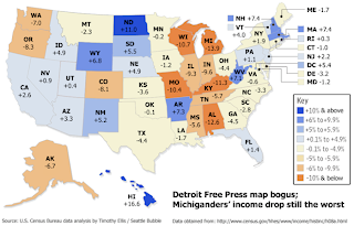 A statistical map is a map that represents graphical information that is put in the form of statistics. The map shows the income percentages of each state in the United States in 2008. It also shows that Michigan has the lowest income level while Hawaii has the highest. http://hoekstrasmaps.blogspot.com/2009_04_01_archive.html
"Cartogram map"
"Flow map"
 Flow maps are used to show the order of an event and the relationships of the stages in the process. In the map you can see the progress of what it would take for someone to go to school. You see in the map it flows from a patient wanting a referral to the front office to the insurance company. It flows from one event to another. http://www.aafp.org/fpm/2005/0400/p61.html
"isoline map"
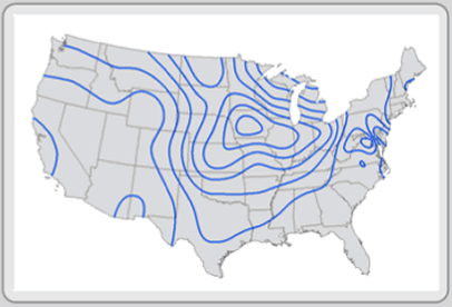 Isoline maps are used to represent a three dimensional model on a two dimensional scale. This is done by connecting lines that represent the same value. This map shows the weather in the United States. As you can see there are lines across the map and those lines form circles. Each circle has a particular weather in that area, which isn't shown on this map.
http://giscommons.org/output/
"Proportional Circle map"
 Proportional circle maps use circles to represent different data values. The bigger the circle the more data that is shown in that area. In the map it shows the traffic fatalities in the United States in 2009.
http://personal.frostburg.edu/mtmaier0/Symbol_1.jpg" imageanchor="1" >
Proportional circle maps use circles to represent different data values. The bigger the circle the more data that is shown in that area. In the map it shows the traffic fatalities in the United States in 2009.
http://personal.frostburg.edu/mtmaier0/Symbol_1.jpg" imageanchor="1" >"Choropleth map"
 A choropleth map is a map that uses differences in shading or coloring in an area to represent the average values of a quantity of something in that area. The map shows the Latino population in the state of Florida in 2000. The darker the area the more dense the population. http://my.ilstu.edu/~jrcarter/Geo204/Choro/Tom/
"Dot Distribution map"
 A dot distribution is a map that uses dots to portray a feature such as a disease or a something similar to that. In the map it shows how AIDS was distributed in the United States up to 1997. Each dot represents 30 cases of AIDS. This map is a great example of a dot distribution map because it uses dots to describe the distribution of AIDS.
https://blogger.googleusercontent.com/img/b/R29vZ2xl/AVvXsEi3U8r_T7DUod02M0NRccvdwU2c2aGHBRkxXswKrc-eAvYHDVGFgu8xt1f58_saZnBJKqkydYC8Hw_gVZJqt7ldTdbBgmO7fSFMdJc2T2tD5AWnPHltJZFYxeBci7WrbtbJaylJqZRHcf0/s1600/dot+distribution.png" imageanchor="1" >
A dot distribution is a map that uses dots to portray a feature such as a disease or a something similar to that. In the map it shows how AIDS was distributed in the United States up to 1997. Each dot represents 30 cases of AIDS. This map is a great example of a dot distribution map because it uses dots to describe the distribution of AIDS.
https://blogger.googleusercontent.com/img/b/R29vZ2xl/AVvXsEi3U8r_T7DUod02M0NRccvdwU2c2aGHBRkxXswKrc-eAvYHDVGFgu8xt1f58_saZnBJKqkydYC8Hw_gVZJqt7ldTdbBgmO7fSFMdJc2T2tD5AWnPHltJZFYxeBci7WrbtbJaylJqZRHcf0/s1600/dot+distribution.png" imageanchor="1" >"Propaganda map"
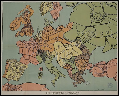 A propaganda map is very similar to propaganda cartoon. It portrays something in an inaccurate way or created using subjectivity with the goal of persuasion. They cartographer draws the map for the same reason a cartoonist would draw a propaganda cartoon. In the map you can see how each country was seen through the eyes of a Dutch cartographer. It shows how each country acted toward each other during that time period. http://dish.andrewsullivan.com/2013/07/22/maps-as-political-tools/
"hypsometric map"
"PLSS map"
 PLSS, Public Land Survey System, is a way the United States divides the land up. It is normally used for rural areas or undeveloped land. The map that you see here shows how Florida is broken up. It separates the counties to show how much land each county uses. This is a PLSS map because it shows how the land is split up between the counties. Granted it isn't a rural area but it does portray the land use.
http://cartographic-catalog.blogspot.com/2012/04/public-land-survey-system-plss.html
"Cadastral Map"
 A cadastral map shows the property area of a city or region. It shows the space of each land. For instance a cadastral map of a neighborhood would show the size of the land that each house can occupy. In the map here it shows the historical map of Washington D.C. and how much each building occupied.
http://www.dcvote.org/trellis/character/historicalmaps.cfm?print=1
"Thematic Map"
 Thematic maps are used to portray an area and apply a theme to it. The theme can be social, political, agricultural, and other aspects to define a city, region or country. In this map it shows what political party is running each state in 2007. It portrays how the Republican party was running the majority of the United States. This map shows how a thematic map works.
http://www.gigawiz.com/thematic.html
"Topographic Map"
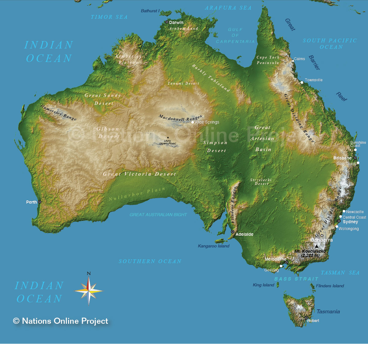 A topographic map shows the natural layout of the area. This map shows the topographic layout of all of Australia. It shows where the desert, mountain ranges and the basin. This map is a prime example of what a topographic map is.
http://www.nationsonline.org/oneworld/map/australia-topographic-map.htm
"Planimetric Map"
 For this map it conveys a planimetric map. A planimetric map is when a map shows a grid-like structure on the map. It shows the layout of the area without showing the elevation of the area. The map that is portrayed here shows the layout of city of Manhattan and all the streets and neighborhoods within the city.
http://similaritymatrix.blogspot.com/2009/09/planimetric-map.html
Subscribe to:
Comments (Atom)
